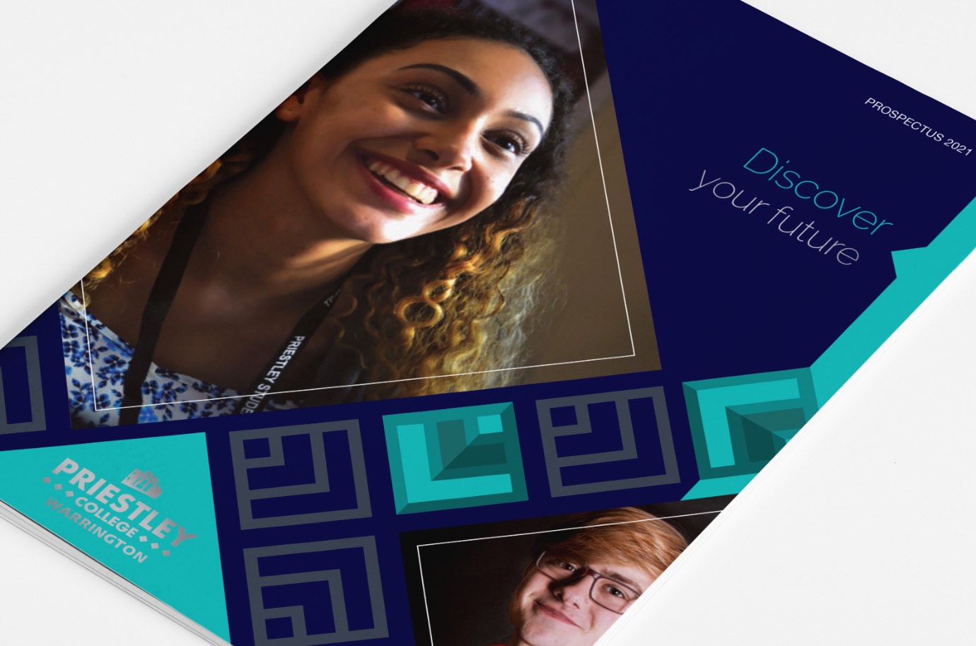
The 2021 Priestley College prospectus has received positive feedback from both the college and potential students for several reasons. The prospectus uses the college’s corporate colours – navy blue, grey, and turquoise. This combination creates a striking and cohesive colour palette that is visually appealing and reflects the college’s brand identity.
Our aim here was to design a Prospectus with a completely fresh new look for 2021. At Heckford we combined a striking layout with exceptional photography for product that really does deliver.
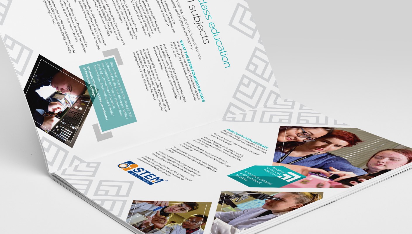
Colour palette
The use of navy blue, grey, and turquoise in the prospectus design is notable for several reasons. Navy blue is a classic colour associated with professionalism, trustworthiness, and reliability. It is a colour commonly used in corporate branding. So it is fitting that Priestley College would use it as one of its corporate colours.
The use of grey in the prospectus design is also noteworthy. Grey is a neutral colour associated with balance, sophistication, and timelessness. It is a versatile colour that can create a sense of calm and stability in a design.
Finally, the use of turquoise in the prospectus design adds a pop of colour that is both fresh and modern. Turquoise is a colour that is often associated with creativity, innovation, and youthfulness. It is a colour that can create a sense of energy and excitement in a design.
Graphical inspiration
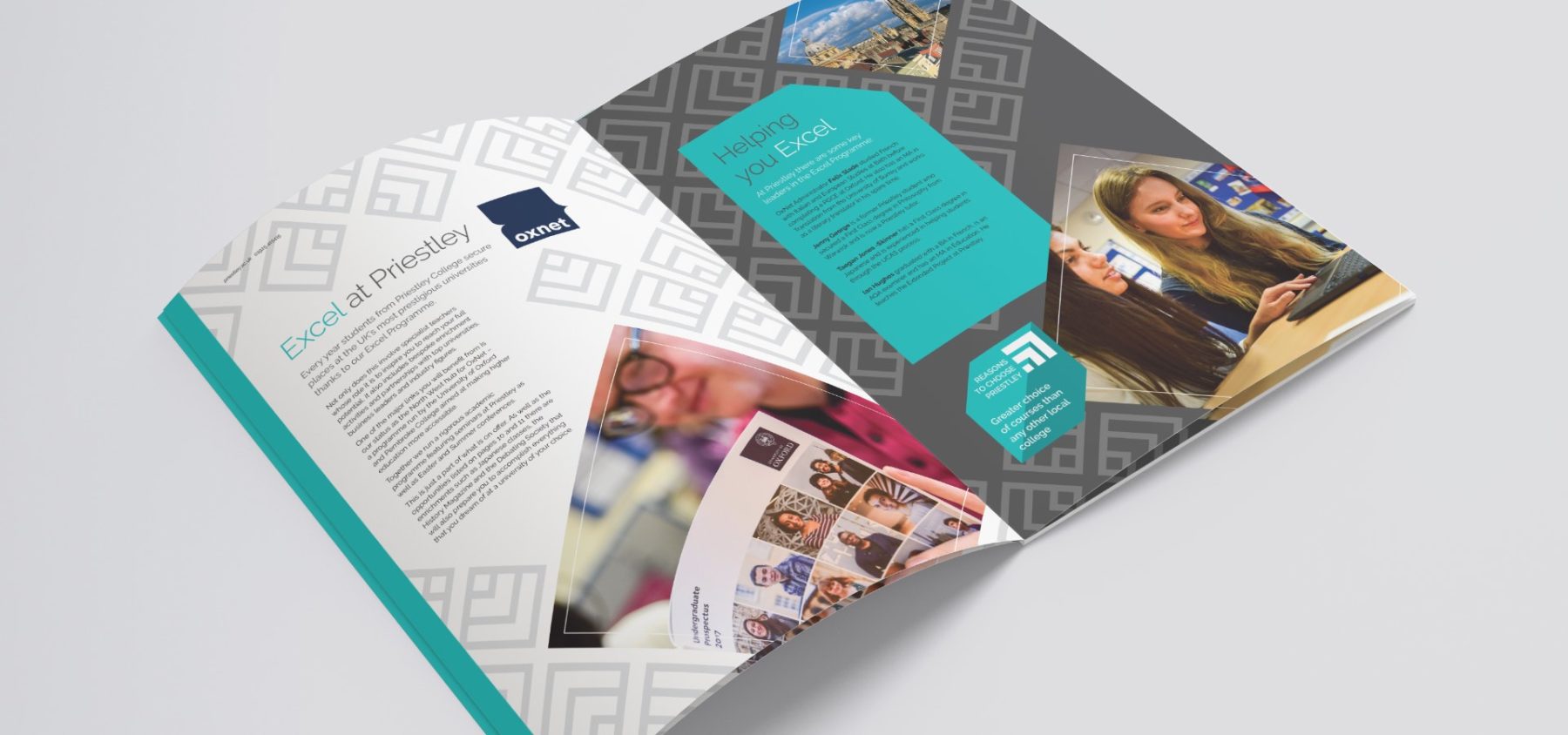
In addition to the colour palette, the graphic design of the 2021 Priestley College prospectus is also notable. The prospectus features a geometric diamond pattern inspired by the diamond shapes in the college’s logo. The use of this diamond pattern serves as a visual connection between the prospectus design and Priestley College’s branding.
The diamond pattern is used in several ways throughout the prospectus. It is used as a background pattern for some of the pages, adding texture and visual interest to the design. The prospectus is also used as a way to frame images. It creates a cohesive visual language that ties the different elements of the prospectus together.
By incorporating the diamond pattern into the prospectus design, Priestley College is able to create a consistent and recognisable visual identity across different marketing materials. The pattern is a subtle nod to the college’s branding that adds an extra layer of sophistication and professionalism to the prospectus.
Textured feel
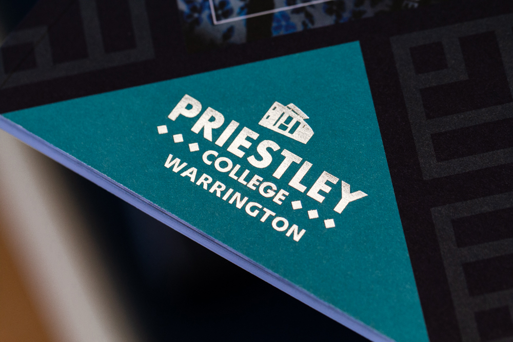
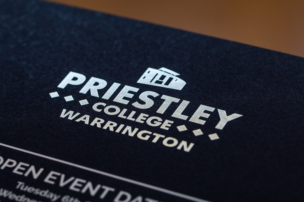
In addition to the colour palette and graphic design, the printing and finishing techniques used in the production of the 2021 Priestley College prospectus are also noteworthy. Specifically, the college chose uncoated stocks for the paper, giving the prospectus a tactile feel that is both pleasing to the touch and reflective of the college’s commitment to quality.
In addition to the paper stock, the front and rear covers of the prospectus were enhanced by using silver foil on the college’s logo. This technique not only makes the logo stand out against the navy blue colour of the cover but also adds a touch of elegance and sophistication to the design. The subtle use of silver foiling was an intentional choice to maintain an upmarket appearance for the prospectus.
Overall, the use of uncoated paper stock and the addition of silver foil on the college’s logo in the 2021 Priestley College prospectus design are both examples of how small but deliberate details can elevate the overall design and appearance of a marketing piece. The tactile feel of the paper and the use of foil stamping are elements that add to the prospectus’s overall high-quality, sophisticated look and feel.