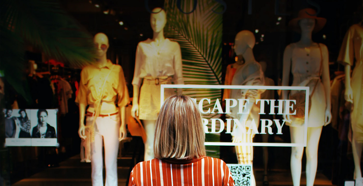
Window displays are for much more than just informing shoppers about the products you company is offering. When this is done right, window displays intrigue customers not only about the products, but also inside the store. Use the aesthetics of a shop window as an invitation to immerse them in your brand, this is the first and sometimes the only opportunity to show what your brand is all about
While promo signage and the shops layout play a significant role in driving sales & footfall, creative window displays are the most important factor.
Window displays are a key factor in whether a potential customer enters the shop or keeps on walking, an effective shop window may seem out of reach for smaller retailers, especially when their budget wont stretch as far as they may like. Heckford can work with you to help to create a shop window that will turn heads.
Don’t Over Complicate it
A busy window display may cause shopper to stop in awe, but it doesn’t mean they will come in and buy anything. Focus on the offer and make sure it is a clear message.
Change things Up
Many retailers believe they have to change their windows once a month to remain current and relevant. This limits your budget and they will lack the impact you are looking for.
Lighting is Key
Even the most creative window, will fall flat if it’s not correctly illuminated. It can make or break a window consider using LED lights to direct the light exactly where you want it to be for maximum impact.
Be a story teller
Many window displays have a theme, whether it’s a colour, shape, style or category. You should tell a story, communicate the idea., and don’t restrict to displaying only the clothes use props that support the display’s story or brand image they are a welcome addition.
Bring an element of surprise
Speaking of props, here at Heckford we can advise you to put something unexpected in the window as long as it fits the story or theme. People generally take photos and are in awe of the unexpected and it turns heads, so don’t just display products on plinths, incorporate them into the entire design. Placing a chair on a wall or a Christmas tree upside down will get people looking and talking, think creative and think outside the box
Its all about layers
Layering is a great tactic to make the window visually appealing. Start with a vinyl graphic on the window, then place props, mannequins and other products in the window. Then add a backdrop behind the window display for the final layer. Each layer will attract attention from a different distance: across the street, from the Bus, and on the pavement. Layering print is a clever budget friendly way to fill your windows, here at Heckford we have great graphic designers who will make those graphics pop! And make you stand out. Displaying items in odd numbers (three, five or seven) is another trick you can use to create active eye movement throughout the campaign display.
Repetition, design and movement
Lastly, Heckford advises retailers to stick to three basic rules of design in mind: repetition, contrast and movement. Repeating an item, using multiples of one product or prop creates a strong focal point. This can be achieved in different ways colour, sizing or lighting. If your budget allows, try to add some movement to the window as well with a digital display or even try lenticular graphics. Our eyes always follows something that moves.
Need help bringing your ideas to life? We want to help!!
Contact us now – lee@Heckford-signs.co.uk

 Older
Older